Sound Travels:
Building a brand system from Dual's logo out
CLIENT / BRAND: Dual (Namsung America)
DURATION: 2011 – 2024
ROLE: Art director, lead designer, photographer, strategist
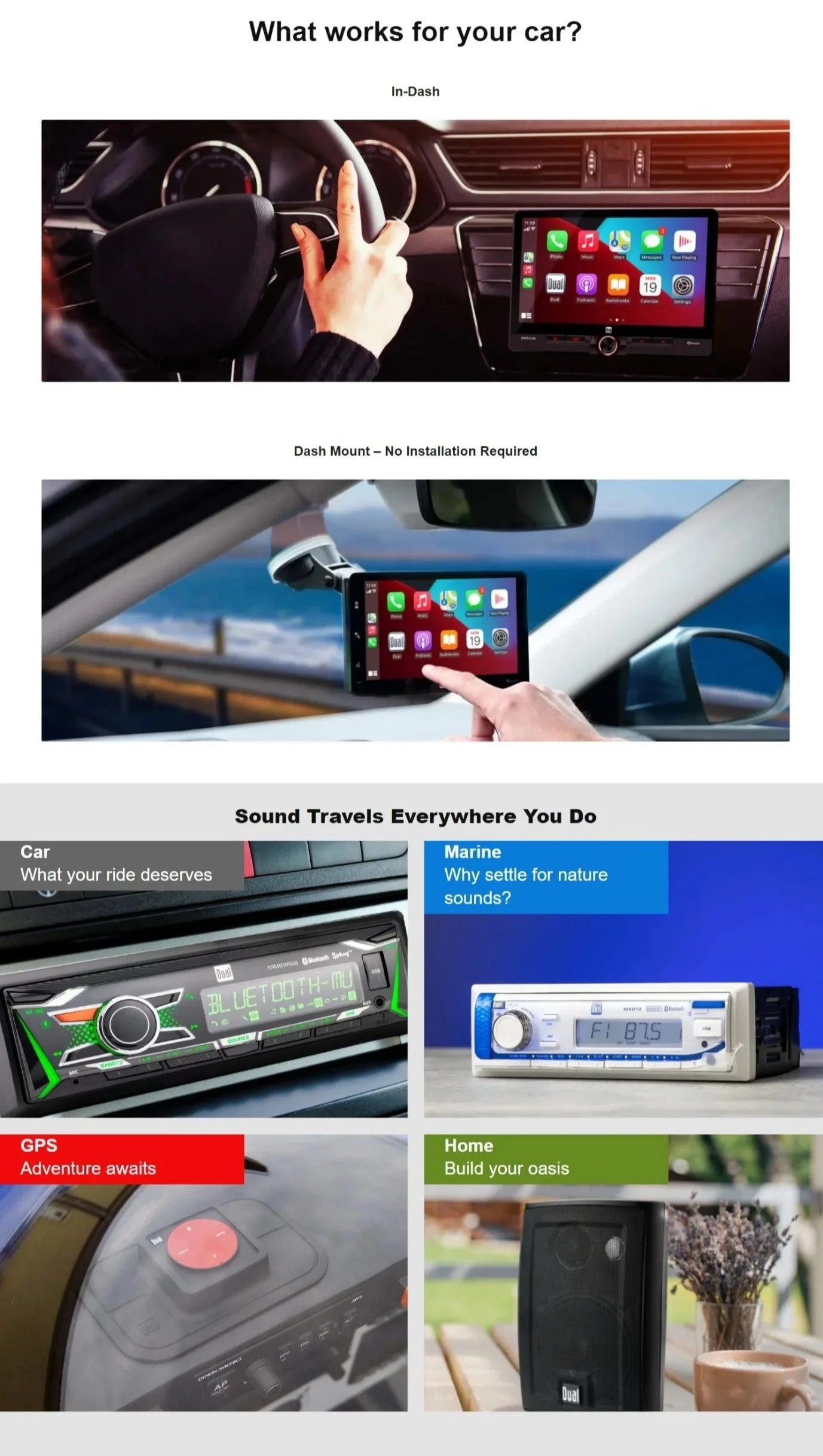
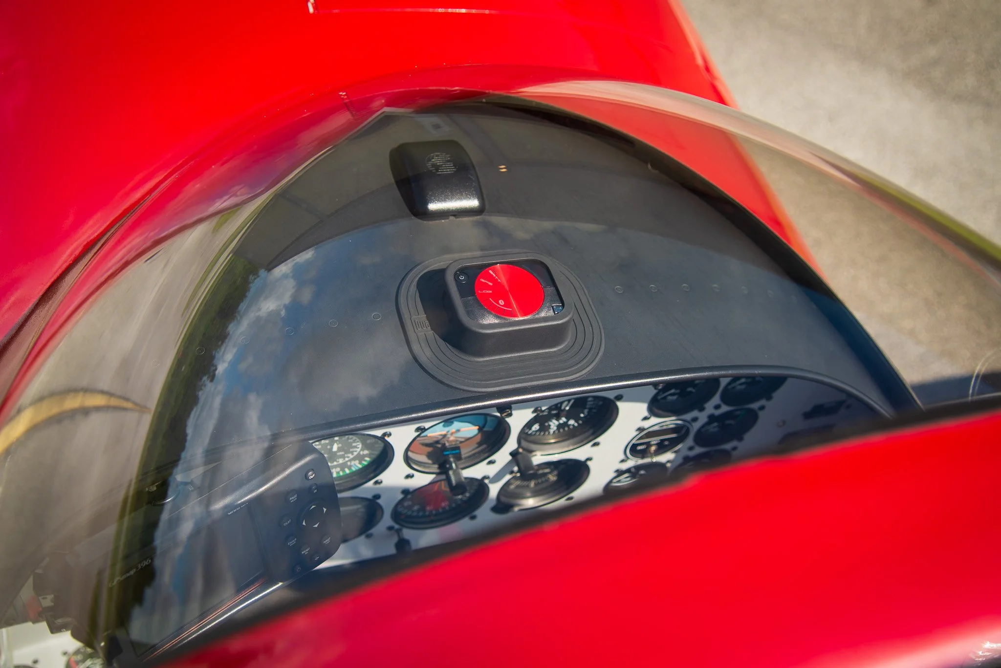
CATEGORIES: Car audio, home, marine, aviation
Challenge:
The Dual brand has been around for over 125 years. It originated in Germany as a brand of turntables and has since transformed into a wide range of consumer electronics products for the car, home, boat, and plane.
When I joined Namsung America in 2011, Dual had an established logo and general color scheme, but there was not codified design language, visual consistency, or brand essence.
Approach:
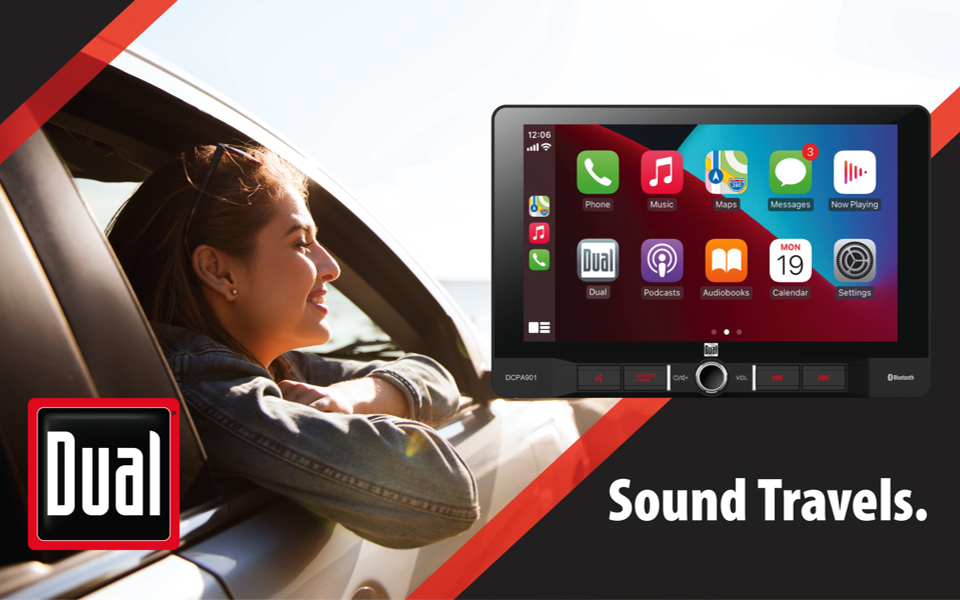
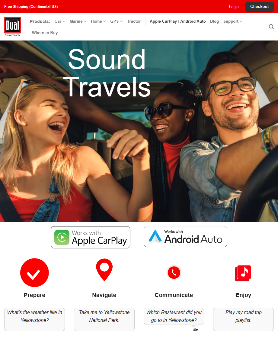
For 14 years oversaw and guided the brand’s visual direction and messaging through packaging, web design, advertising, video production, photography, and copywriting. This meant figuring out what the brand stood for and how to visually communicate that to the consumer. The tagline "Sound Travels" came out of that work, anchoring Dual's audio heritage while speaking to the mobility and freedom its products are built around.
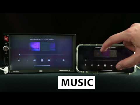
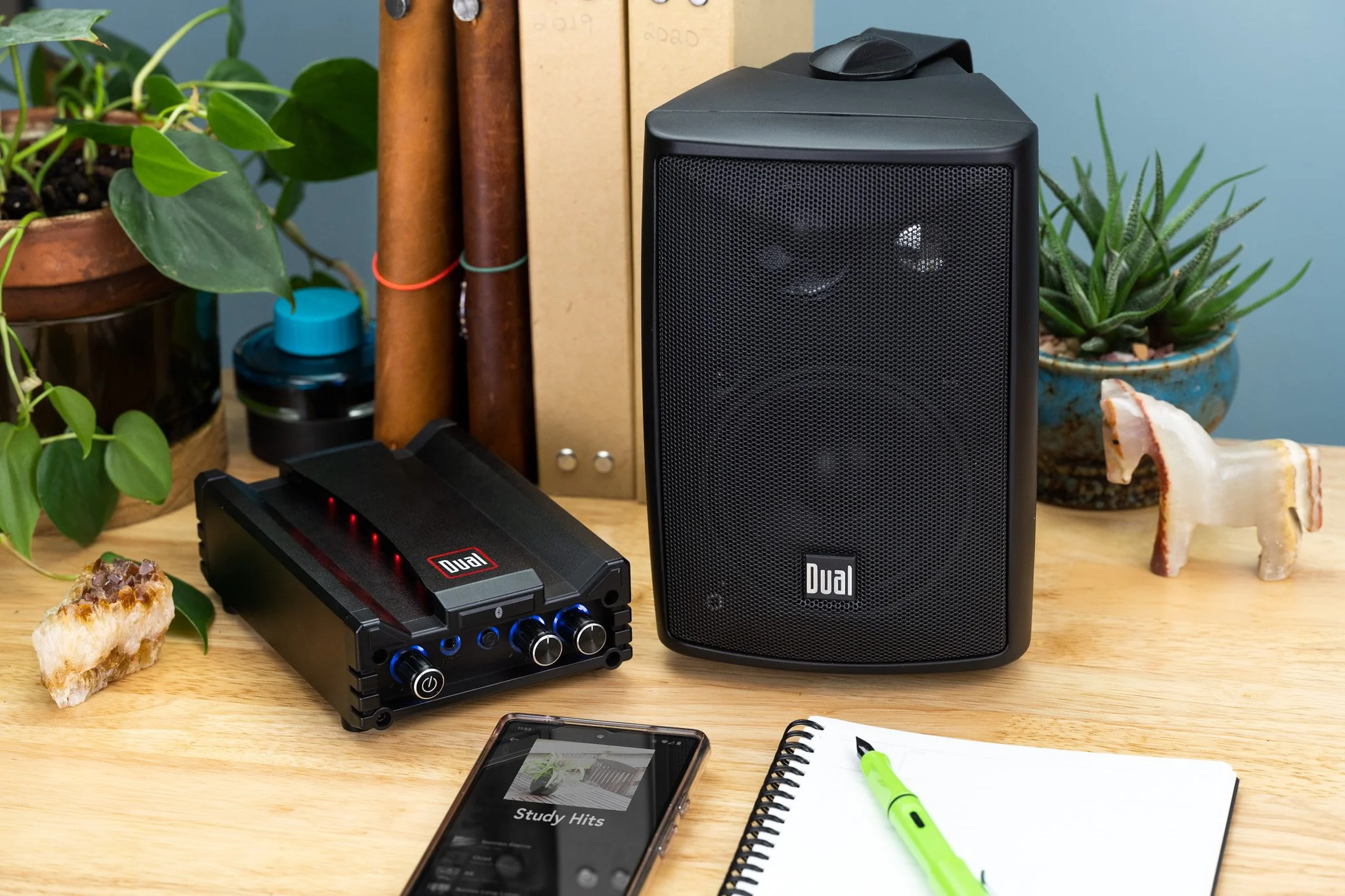
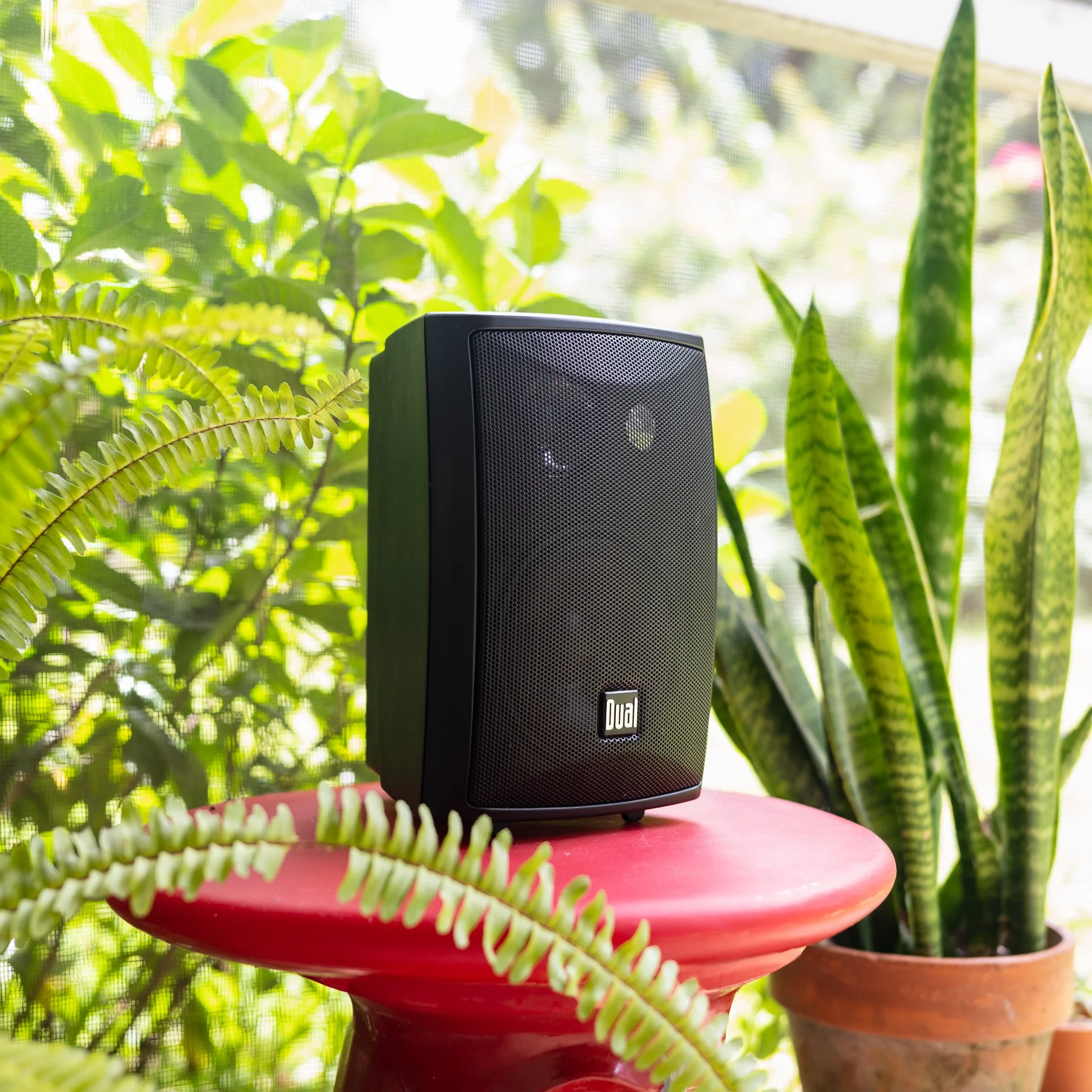
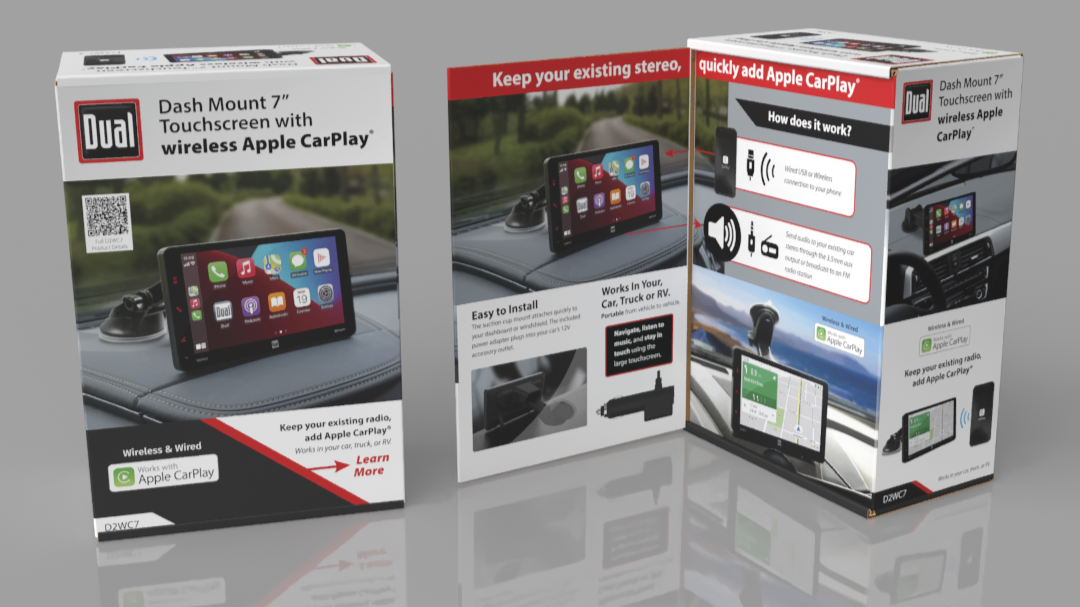
The work was continuous: packaging redesigns for different product lines and sales floors, photography, advertising and tradeshow graphics, video production and website redesigns.
Deliverables:
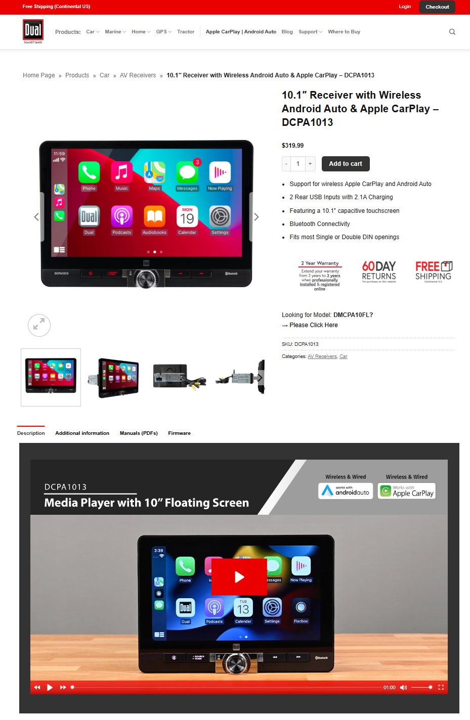
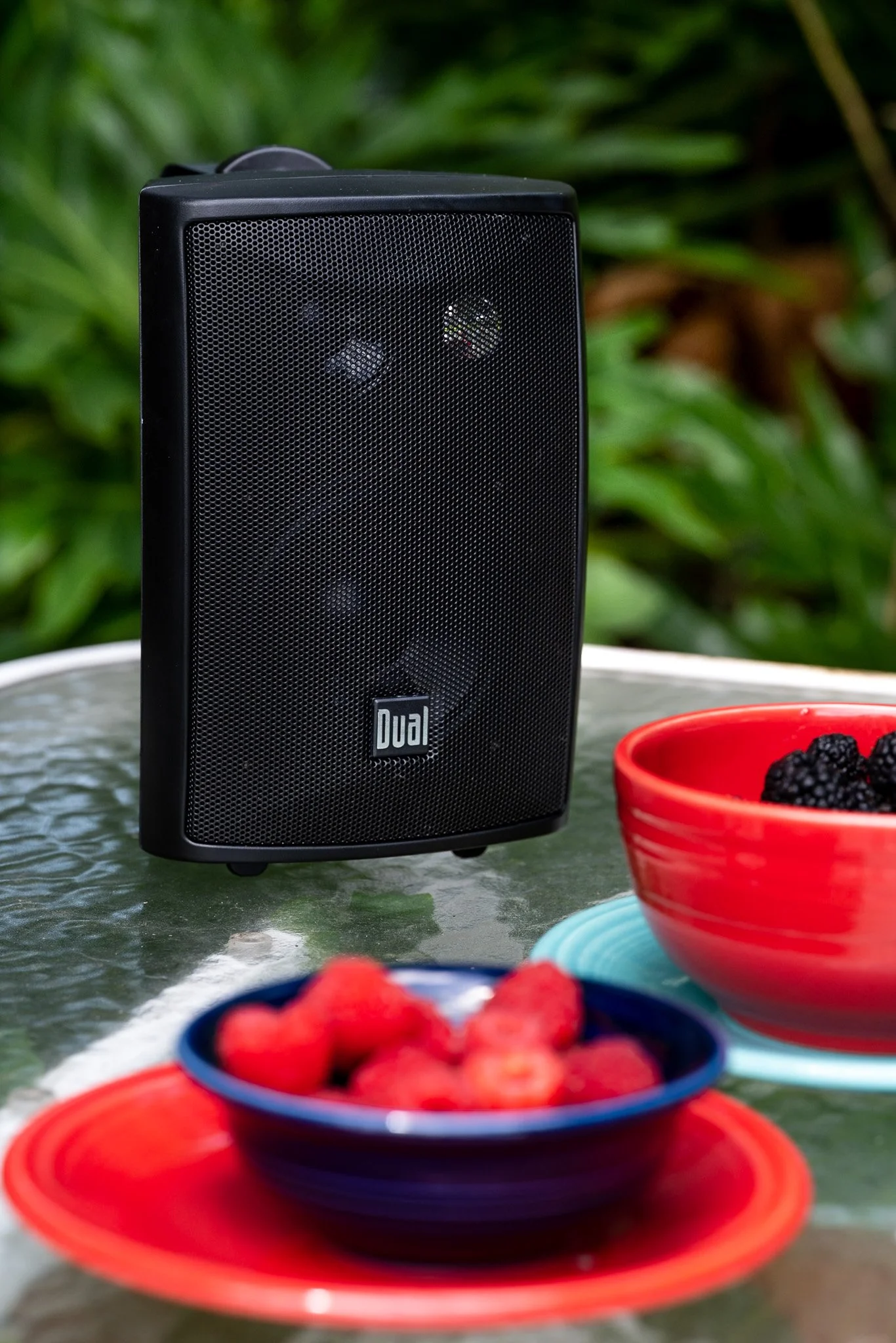
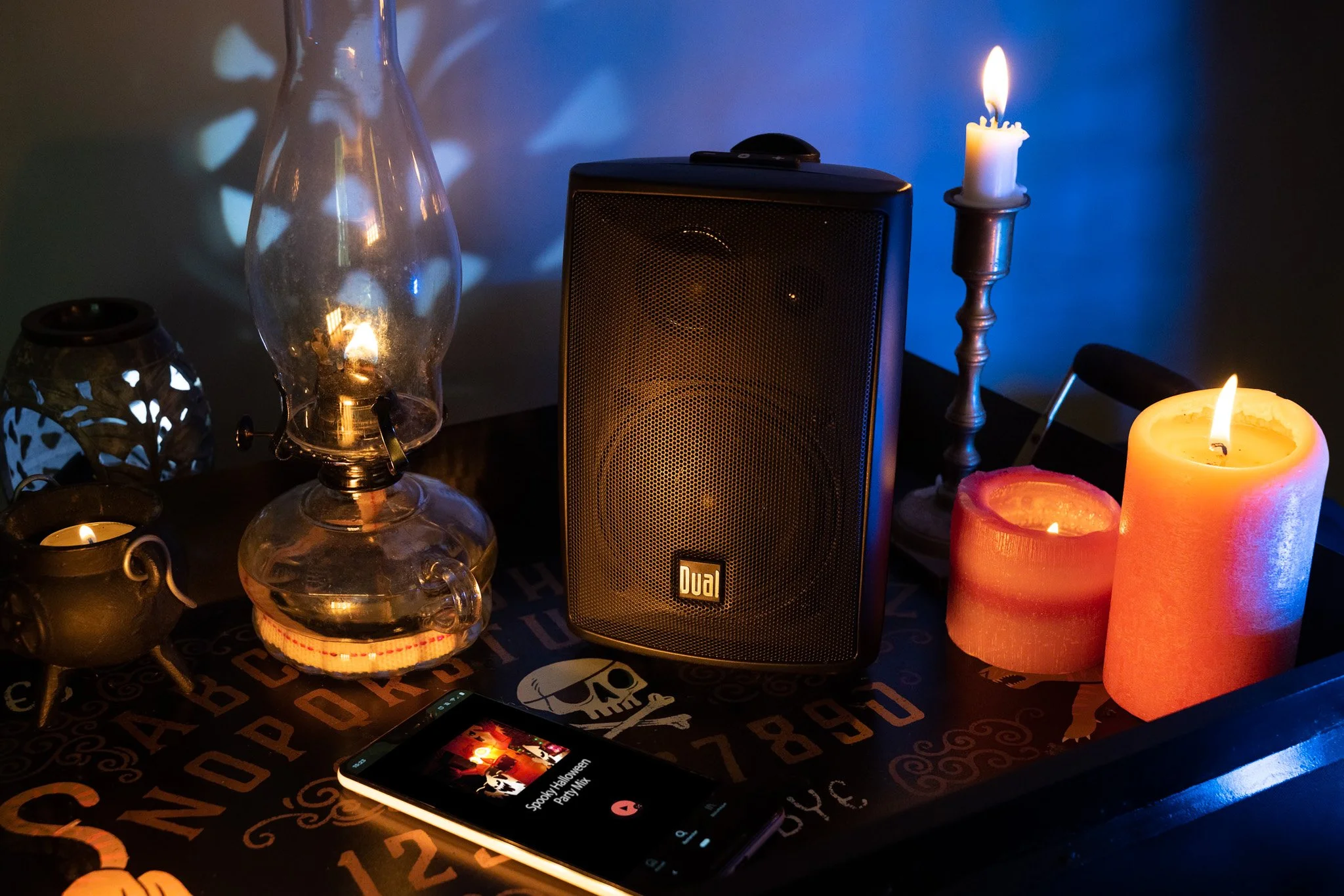
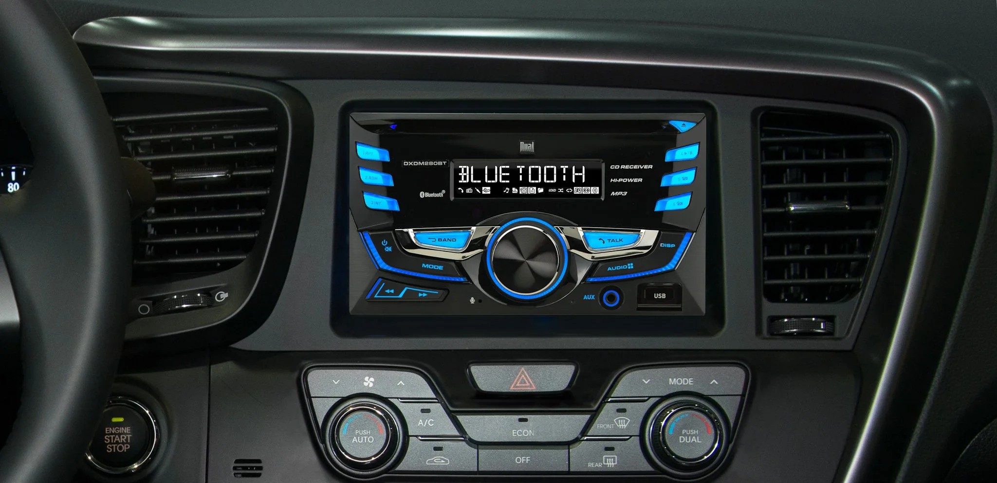
Brand guidelines system | Tagline + messaging framework | 500+ SKU packaging designs | Product + lifestyle photography | Art direction | Advertising + tradeshow graphics | Video production | Website redevelopment
The Outcome:
Dual expanded across product categories, each expansion supported by a consistent visual system. The packaging work in particular, across 500+ SKUs in 20,000+ retail locations, made Dual recognizable on shelf. Working with a small team to maintaining quality and accuracy over that many touchpoints was an enormous challenge, requiring careful attention and a constant drive for finding news ways to improve the system and storytelling.