Connect Your Journey:
Positioning Jensen as the premium tier, with the same products
CLIENT / BRAND: Jensen (Namsung America)
LICENSE: VOXX International
ROLE: Art director, photographer, strategist
CATEGORY: Car audio
A licensed heritage brand, an outdated visual identity, and a creative problem with no obvious answer: how do you make two products with identical specs feel meaningfully different to someone standing in a retail aisle?
The Challenge:
Jensen is a heritage audio brand licensed from VOXX International, positioned by Namsung America as the premium tier above Dual. The tension was immediate. The underlying products were functionally identical to Dual's lineup, but Jensen needed to command a higher price and feel like a more serious brand. Differentiation had to come entirely from identity, not hardware.
The Approach:
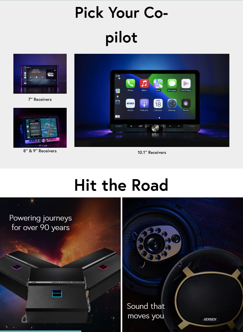
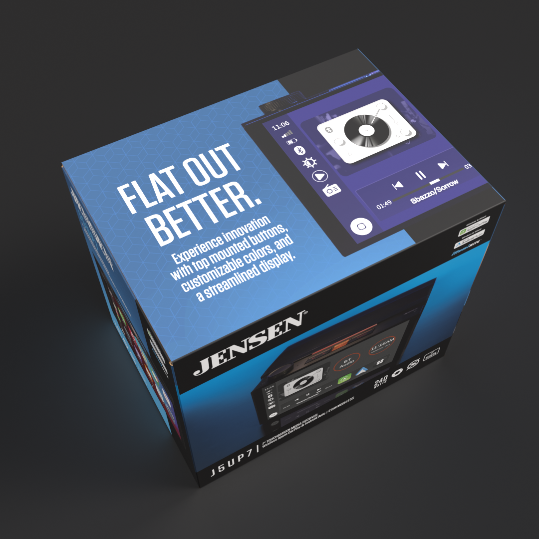
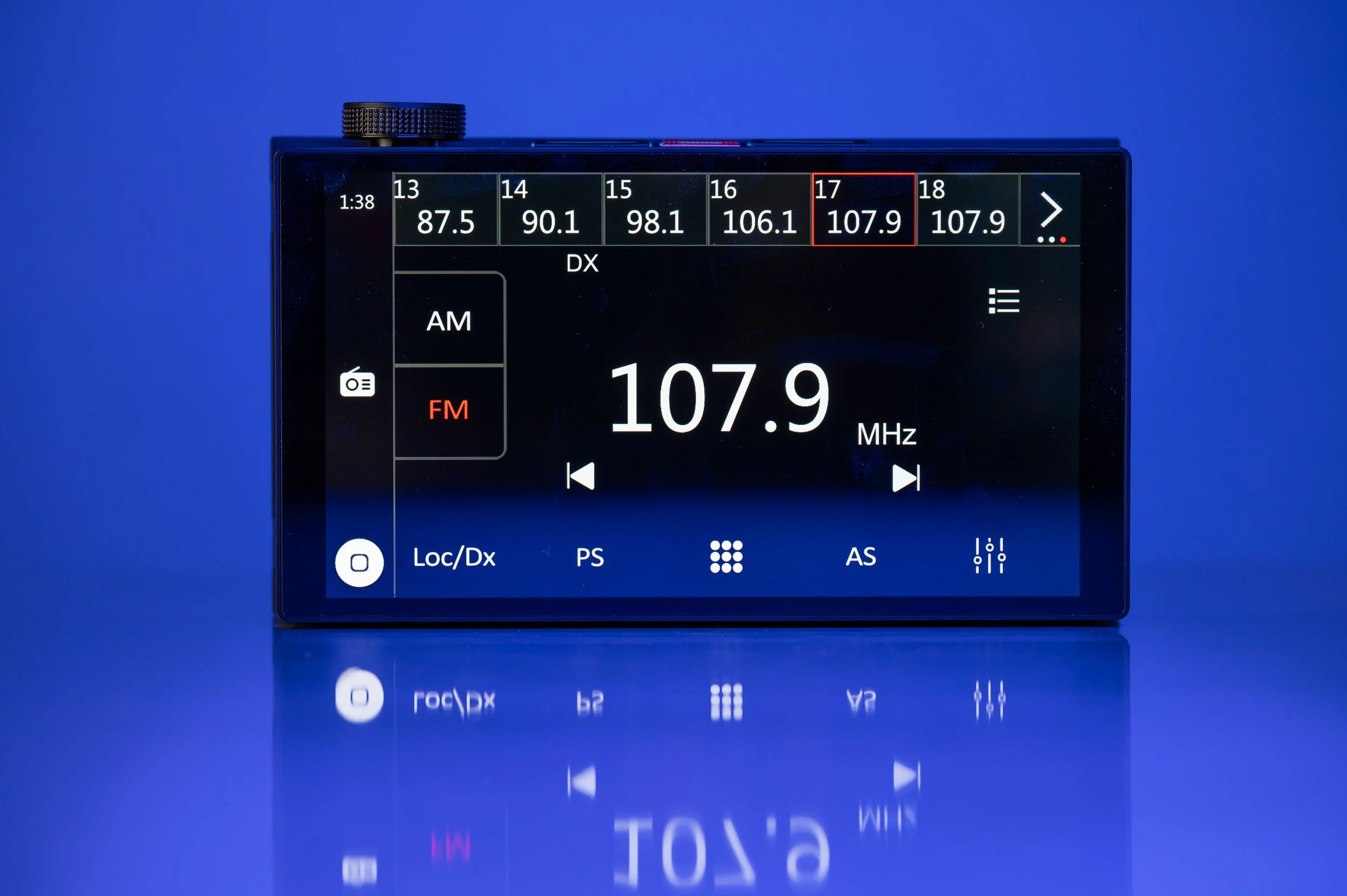
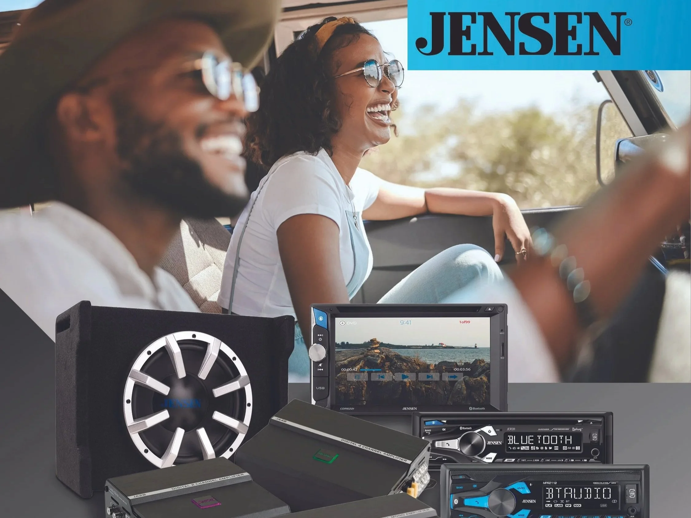
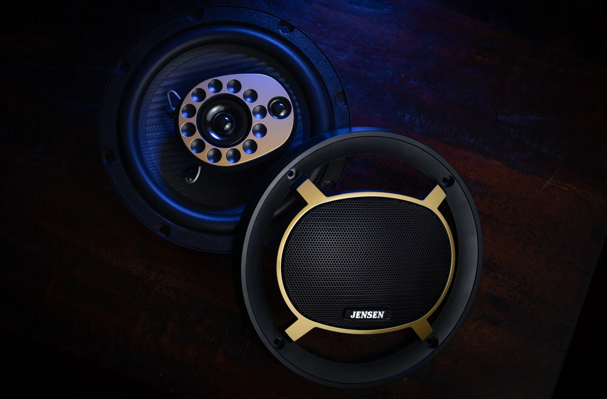
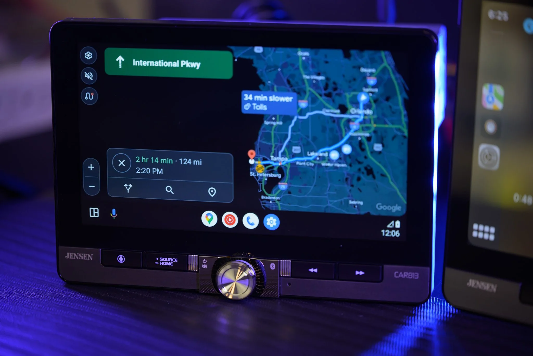
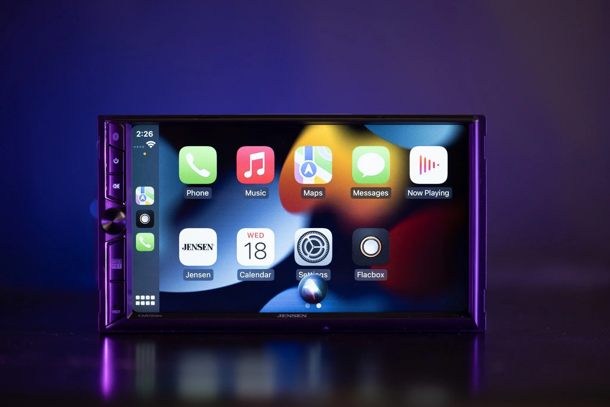
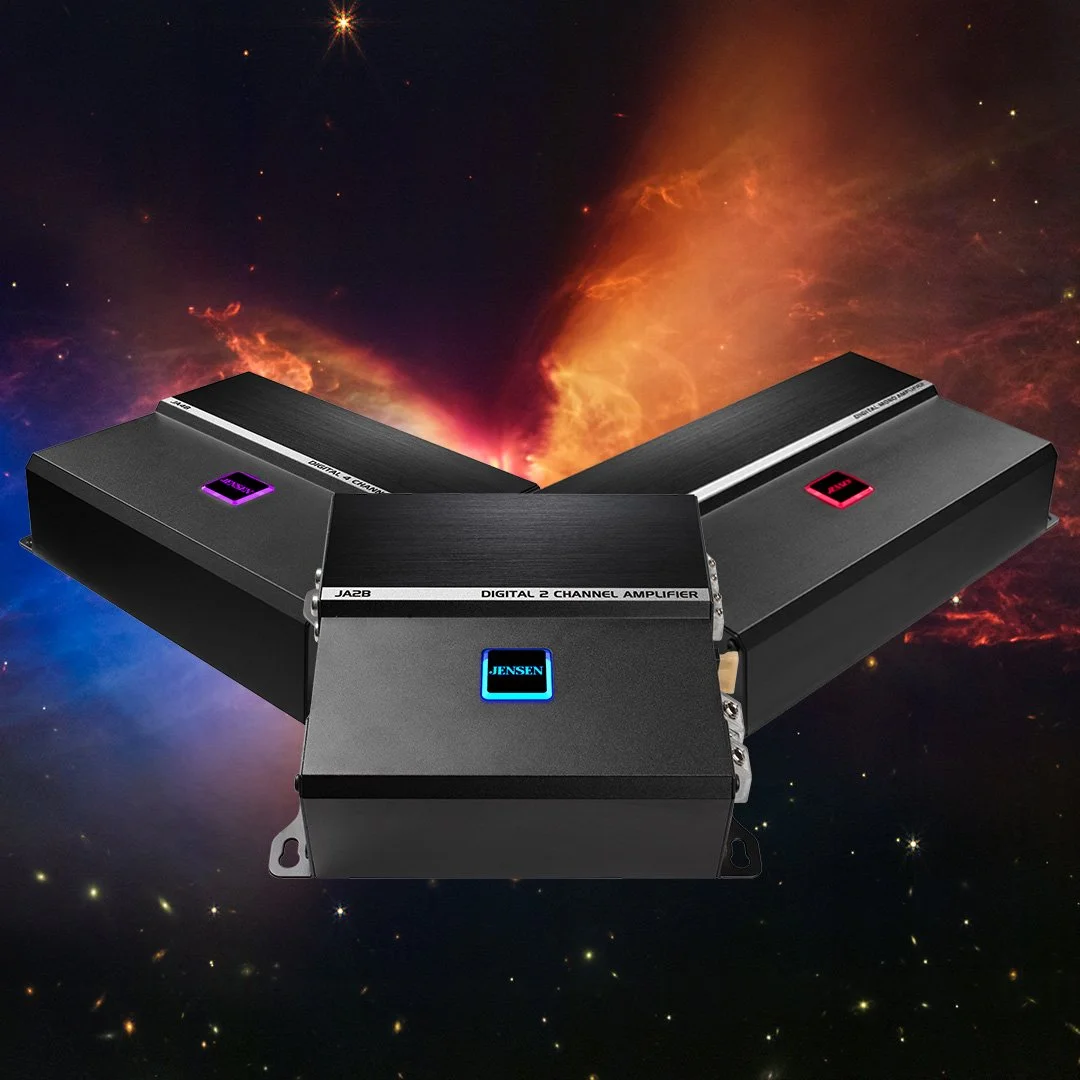
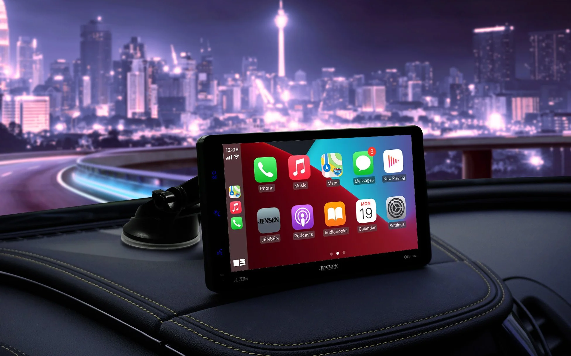
I took Jensen in a bold, high-performance direction, a deliberate contrast to Dual's accessible lifestyle aesthetic. Where Dual used large lifestyle imagery and clean white backgrounds, Jensen leaned into darker palettes, dramatic product photography, and typography that signaled quality before anyone read a feature claim.
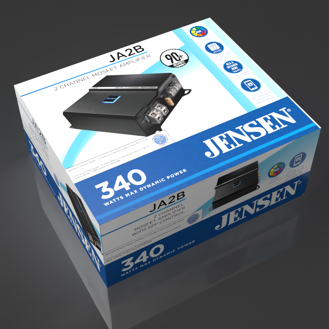
Packaging was the primary lever. Across 150+ SKUs, I built a visual system using rich color blocking, stronger photography, and a refined information hierarchy.
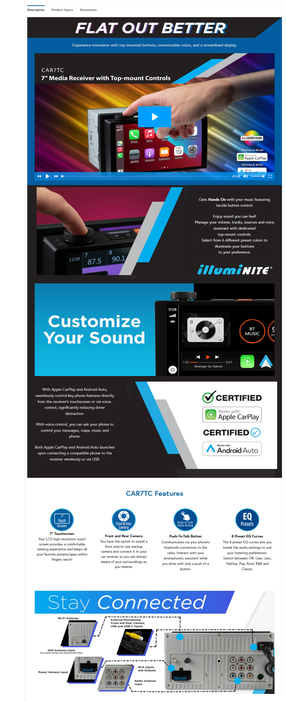
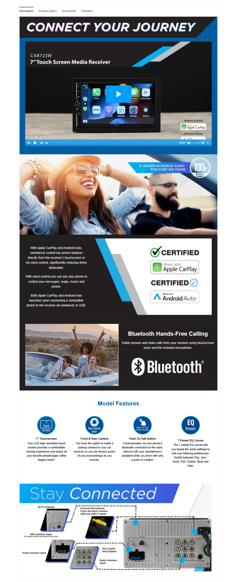
The website redesign moved Jensen from a product-catalog approach to actual brand storytelling, leading with the brand's heritage in high-performance audio and giving customers a reason to choose Jensen before they ever reached the spec sheet.
Deliverables:
| Packaging redesign (150+ SKUs) | New product line visual identity | Photography + art direction | Website redesign | Advertising + tradeshow graphics | Tagline + messaging |
Outcome:
Jensen came out of the redesign with a visual identity that could credibly support its premium positioning, creating a clear difference from Dual at shelf without any change to the underlying products. The packaging system held together across 150+ SKUs and multiple categories.
The website shifted Jensen's digital presence from a feature list to a brand. For a licensed brand working inside an inherited framework, the result showed that strong visual strategy can do the work product differentiation cannot.